
New print series "Coastal Paths"
Over the past few years, I've been playing with ideas for coastal prints. Initially, I started by making assemblages of seaside flotsam, like bits of driftwood, ropes, pebbles and shells.
I wanted them to work with real-life objects such as beach huts and boathouses and look as if they had been created as pieces of art rather than things you would find on the beach.
My first print in this style was Safe Harbour, mixing the elements and becoming what I call an assemblage.

I printed Safe Harbour in 2017, and though I've played with the ideas since, I now feel that assemblages are not for me, and instead, I'm enjoying working with scenic compositions. They might not all be 'real' places, and many feature items from Safe Harbour, such as driftwood, seaweed and rocks, but the one element in all are coastal paths.
I love the paths in the places we regularly visit and wanted to represent them in my prints, so I decided to create a mini-series of prints.
The way paths and small country lanes can twist and turn, round corners, steep up a hill and then down to a beach, led me to the first of these new prints.

I love steps coming down between rocks, so I worked with that idea and to take the steps onto a beach, down a slipway with a boathouse. Creating the steps and path allowed me to use different illustrative textures, which I've developed further in the other prints.

My original idea for Rock Stack was to show a bay with a path winding high across the fields on the clifftop, with a rock stack rising up in a cove. I wanted to add walkers too, which seemed like a risk at the time, but I'm now very pleased with how they work in the scene.

As you can see, I'll start my initial sketches anyway; lined paper will do when I've had an idea.
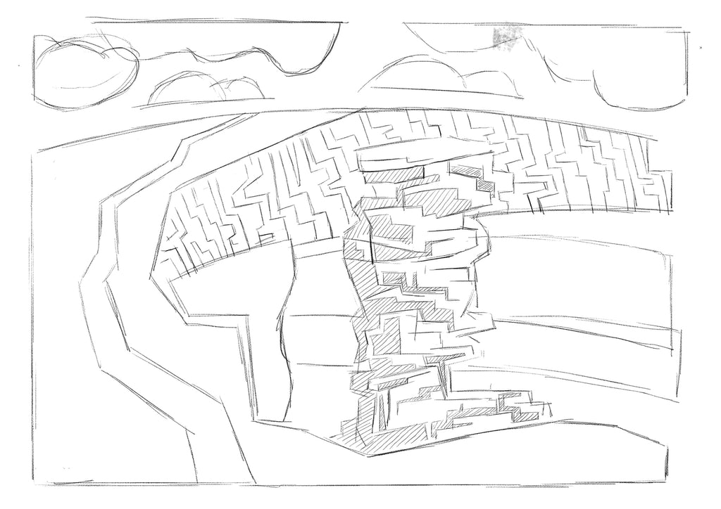
You can see in this and the other prints that I've pushed my experimentation with monoprinted textures and different textures such as scraped ink, rollered ink, stippling, and natural media such as pastels. I also played with halftones to suggest beaches.

By building up the textures, having the beach, cliff face and field with the path, I'm happy with the sense of depth. The combination of colour and texture highlight the dynamics between the rock stack and the cliff face.

I have been sketching Beach Huts for a few years now, often on different levels with crazy steps and stilts.
I originally planned to do a print that looked like a construction involving driftwood, back when I was slightly obsessed with making prints mixed with the assemblages and real-life buildings.
I imagined that there were planks of driftwood supporting shells and pebbles with details in front.

I think many of the changes that I made were part of me developing my style and feeling more confident in how I work. I sketched beach huts again but now in a more abstract way.

Slowly, as I got into making compositions that looked more like they could be real scenes, the print started to change.
As part of the coastal path series, the path is a vital connecting element through the print. However, rather than texture this time, the path is a white space connecting the fields, beach and sea.
The print is divided into three columns, then into blocks of colour, across which the elements' shapes sit. It almost feels like an optical illusion when you look into the print, and the use of colour heightens this.

I worked with four colours in this print, but some of them were translucent, like the cyan and the black, to achieve a green and darker version of the yellow, cyan, and brown.

Getting the registration correct for the print was vital to make the overlapping colour work well. I'm delighted with the ink colours' translucency and the various elements working together to create the whole scene.