I think many people have a lot of unused space on the walls of their hallway and stairs, it can be the perfect place to display prints. Not large prints and not necessarily focal pieces but I’m suggesting you might want to go for ones with lots of interest, which grab and hold your attention (or anyone else’s) as you pass and bring delight day after day.
I have put together a Pinterest board here collecting together my favourite prints I think might be good for these spaces in your home. Each image on the board links to the artist’s shop or list of galleries where you can find their work and I’ve selected some of my favourites below.
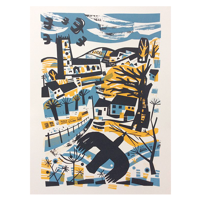
Rooks by Jeremy Speck
Jeremy Speck’s screen prints and linocuts are wonderful on many levels. He employs great use of colour and mark making to capture your interest and keep you intrigued. I particularly love this Rooks print. There’s a vibrancy and life to it which is irresistible to my eye.

Shoreline by Mark Hearld
Mark Hearld is a very clever man, designing single colour linocut prints which are at once complex and fluid, drawing you in to them. He imparts a wonderful sense of contrast in different areas of his prints, resulting in boldly dramatic illustrations. Unfortunately this print is not for sale – Mark is in great demand – but it’s worth following the link to St. Jude’s where you will find his latest work. Mark Hearld’s designs have also been translated to fabric with great effect.

Island Celebration by Angie Lewin
It’s hard to know where to start with Angie Lewin, I love so many of her prints. This print, “Island Celebration” is a good example though. Angie is brilliant at filling the space with wonderful, eye catching detail, and at realising forms in many varied ways. She uses colour spaces in the way some print makers use areas of contrast and she is very playful in exploring mark making. Her prints really hold the eye, even her small prints of which we are lucky enough to own one!

Haunted Woods by Cricket Press
I love prints by Cricket Press, they are incredibly imaginative and well realised and completely different to every other print featured here. There’s a great depth to the colours used in their pieces as well as being compositionally fascinating. I find my eyes wandering around the prints, taking in the unfolding stories.

Devon Farm by Mary Sumner
Mary Sumner’s prints are much more traditional linocuts but there’s a wealth of visual information going on in them, including some great mark making and use of contrast to make the whole thing pop. I love her stylised animals. For a relatively small, single colour print, it works remarkably well.

Fox stopping to smell the roses by Jane Ormes
Jane Ormes never ceases to captivate because she is an expert at creating and employing texture. Her screen prints are wonderful examples of how she spends a great deal of time experimenting and creating her own textures for the visual language of her work. Well this example is not a screen print but is, instead, created from hand painted tissue paper, resulting in beautiful watercolour textures and delicate colours which combine with her charming, characterful animals to great effect.

Another example of the pure joy that can be had from something as simple as a single colour linocut print. Celia Hart imparts a sense of preciousness in the scene of the sleeping hare with bold and simple cuts. The trees on the horizon and the hare have such wonderful character. I think it’s what you’d look for in a print to snag and hold the gaze.

Grey Spires by Jenni Douglas
Finally, Jenni Douglas manages to make the mundane seem extraordinary and captivating with her linocut print of Edinburgh’s buildings. The way she jams the vibrant colours together so they jostle for space and overlap one another and the textures she creates with only the simplest cuts really work for me.
Many of these artists have inspired my work and continue to do so, it’s a joy to be able to look at that work and be inspired to create my own pieces. I hope you like them as much as I do.